From Strategy to Reality: Where the Real Work Begins
In Part 1, we established the big picture:
Export → Transform → Visualize
- Export gives us raw schedule data from Primavera P6
- Transform makes that data usable
- Visualize turns it into insights
If you haven’t read the foundation piece yet, start with Part 1: Beyond the XER — How to Connect Primavera P6 to Power BI for Instant Insights, where we outline the full Export → Transform → Visualize strategy.
Today, we are firmly in Step 2: Transform.
“Power Query — the bridge between Primavera P6 and Power BI”
How Data Comes Out of Primavera P6
Common Ways to Extract Data from P6
Most teams rely on one (or more) of the following:
- Excel export from a P6 layout
- CSV export
- XER extraction followed by Excel conversion
- Database views (less common, more mature environments)
For now, we focus on the Excel / CSV route, because:
- It’s the most widely used
- It requires no admin access
- It works in almost every organization
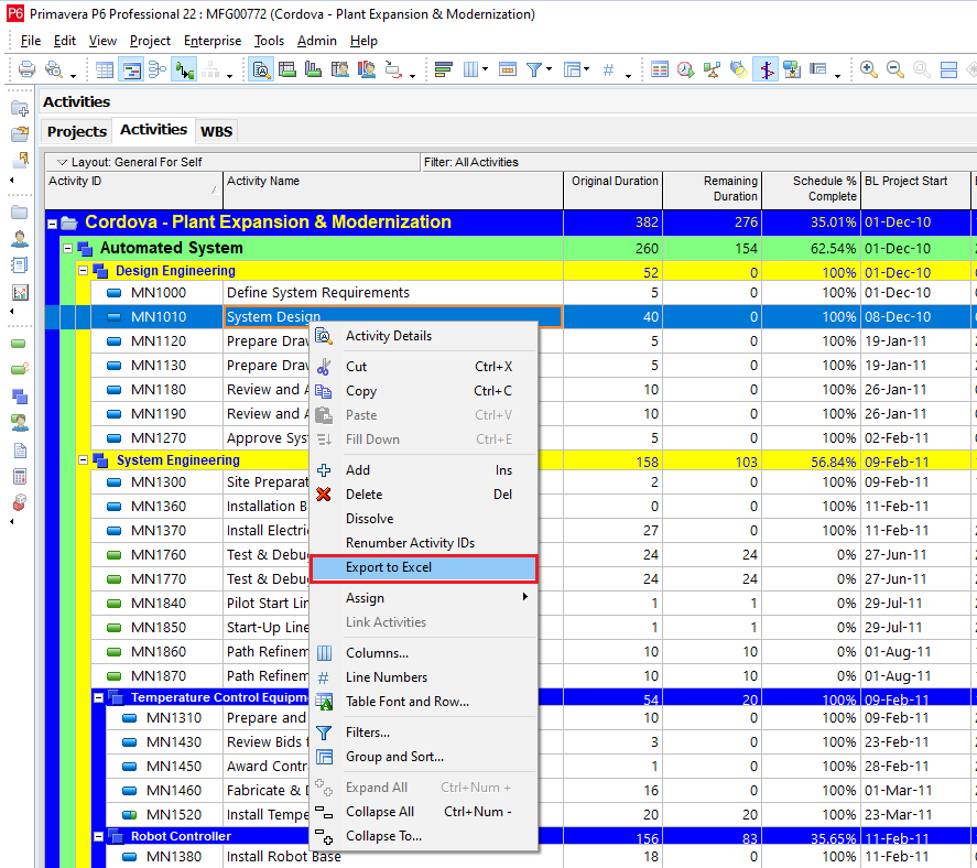
Below is one of the options to have an export. On P6 screen, right click to Export to Excel:

What a Raw P6 Excel Export Really Looks Like

Messy!!!.
Typical issues you’ll see immediately:
- Blank or Multi-line header rows at the top
- Dates stored as text
- Numeric fields treated as strings
- Empty cells where logic expects values
- WBS paths buried in a single column
This is normal.
It’s exactly why manual Excel cleaning never scales and planning teams try to fix this week after week
Essential Transformations
Connecting Excel data to Power BI Desktop
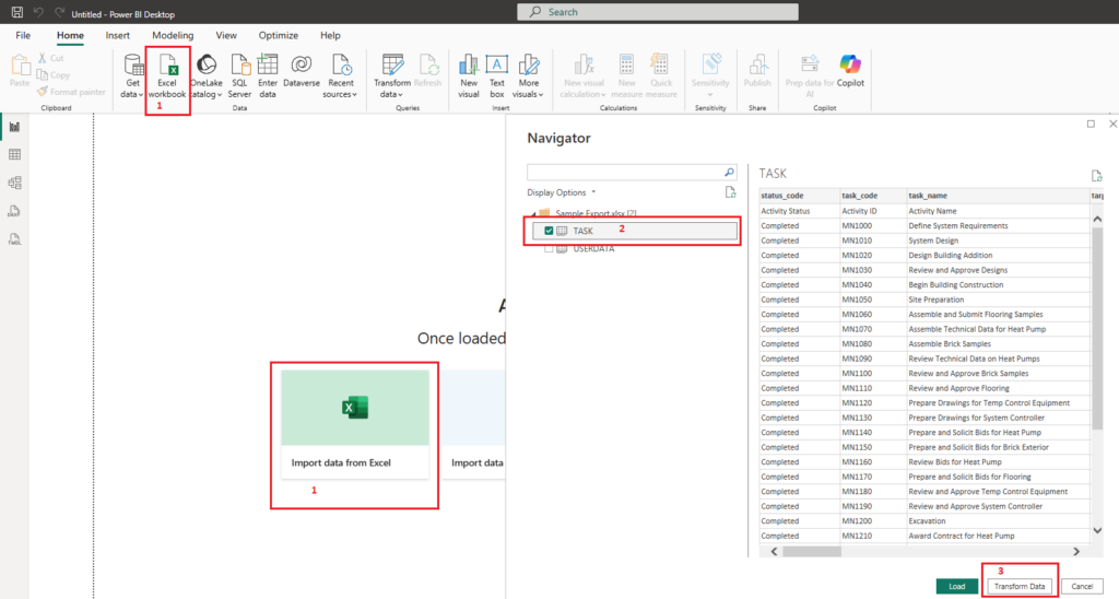
Open Power BI Desktop as a Blank Report:

- Locate option to import data from Excel
- Under the Navigator section, select the tab which has the actual data to be imported
- Select Transform data
You will be presented with a new window where all the Magic happens – The Power Query Interface.
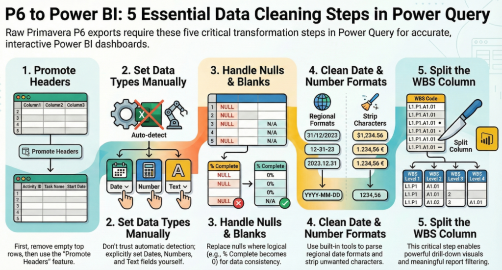
Instead of walking in detail, the visual below captures the five non-negotiable transformations required to turn raw P6 exports into analysis-ready data.
These steps:
- Are performed once
- Are saved as part of the Power BI file
- Automatically reapply to every future export
Think of this as your data cleaning checklist.

If even one of these steps is skipped, the dashboard may still look correct — but it will eventually mislead.
For reference, here is the same logic summarized concisely.
| Step | Transformation | Why It Matters in Project Controls |
| 1 | Promote Headers | Ensures Power BI correctly recognizes activity fields and prevents broken visuals |
| 2 | Set Data Types Manually | Prevents date, duration, and % complete errors caused by auto-detection |
| 3 | Handle Nulls & Blanks | Avoids distorted progress calculations and inconsistent reporting |
| 4 | Clean Date & Number Formats | Aligns regional formats and removes hidden characters that break logic |
| 5 | Split the WBS Column | Enables drill-down, filtering, and meaningful area-level analysis |
Why Automation Matters More Than Cleaning
Here’s the key mindset shift:
You are not cleaning data, rather, You are building a repeatable cleaning process.
Once defined in Power Query:
- Next week’s P6 export is cleaned automatically
- No copy-paste
- No helper columns
- No forgotten steps
This is where schedulers stop preparing reports and start maintaining systems:
- Spend less time formatting
- Spend more time analyzing
- Gain confidence in their numbers
- Build trust with project managers and leadership
Power Query doesn’t make dashboards pretty, It makes them credible.
The Curiosity Hook — Clean Data Is Still Not Enough
At this stage, you now have:
- A clean activity table
- Correct dates and numbers
- Structured WBS levels
In Part 2B, we will:
- Load this clean table into Power BI
- Build our first dashboard
- Create high-impact visuals without touching complex logic
That’s where your data finally starts answering real project questions

