Quick Summary:
- The Problem: Manual XER-to-Excel reporting is slow and error-prone.
- The Solution: Use Power Query as a “bridge” to automate the flow from P6 to Power BI.
- Key Insight: Always treat the Data Date as a parameter to ensure your reporting reflects the correct project status.
The Monday Morning Blues (You Know Exactly What I Mean)
It’s Monday morning.
Your inbox already has three follow-ups asking for the weekly schedule report.
You open Primavera P6, export an XER, dump it into Excel, clean dates, fix broken activity codes, rebuild pivot tables, copy charts into PowerPoint… and finally send a static PDF that’s already outdated by the time it lands in someone’s inbox.
If this sounds familiar, you’re not alone.
After 15 years in project controls, I can confidently say this is one of the biggest productivity killers in our profession.
The good news?
You don’t have to live like this anymore.
Why Static Excel & PDFs Are Failing Modern Project Managers
Traditional schedule reporting breaks down for three main reasons:
1. No Interactivity
- Stakeholders can’t:
- Filter by area, contractor, or discipline
- Drill from Level 1 milestones to detailed activities
- Every new question means… another report
2. High Risk of Human Error
- Manual copy-paste
- Broken formulas
- Inconsistent activity code mapping
One wrong filter, and the entire narrative changes.
3. Time Lag Between Data & Decisions
- Reports represent a snapshot in the past
- By the time leadership reviews them, site conditions have already changed
This is exactly where Power BI changes the game.
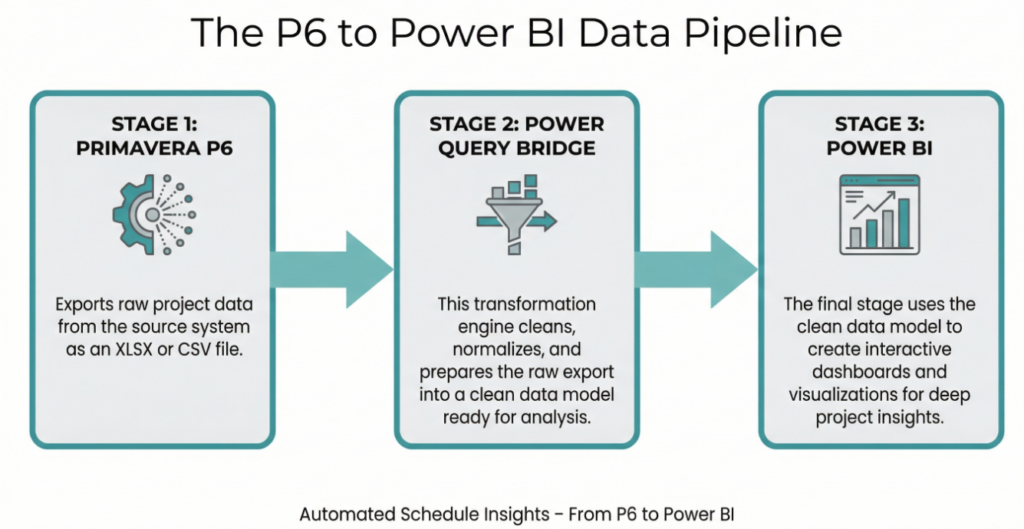
The 3-Step Workflow: From Primavera P6 to Power BI
Let’s simplify this.
A robust, scalable automation boils down to three repeatable steps.

Step 1: The Clean Export (P6 → Excel / CSV)
Forget the raw XER for reporting.
Your goal here is consistency, not complexity.
Best practice:
- Create standardized layouts in P6
- Export only what you need:
- Activity ID
- Activity Name
- WBS
- Start / Finish (Planned & Forecast)
- % Complete
- Activity Codes (Discipline, Area, Phase, etc.)
- Data Date
Step 2: The Data Bridge (Power Query)
This is where most schedulers either:
- Overcomplicate things
- Or skip critical steps altogether
Power Query is your transformation engine.
Here’s what should happen here:
- Standardize date formats
- Rename columns (once — forever)
- Split WBS paths into usable levels
- Normalize activity codes into lookup tables
- Remove blanks, nulls, and duplicates
⚠️ Important:
Do not do this cleaning in Excel manually.
If it’s not in Power Query, it’s not automated.
(Note: If you’ve never used Power Query, don’t worry. This is the strategic overview. In Part 2 of this series, I will walk through the exact steps and show screenshots of how to configure these transformations without writing code.)
Step 3: The Visualization (Power BI)
Once your data model is clean:
You can build:
- Interactive schedule health dashboards
- Plan vs Forecast comparisons
- Milestone slippage trends
- Discipline-wise progress views
- Critical path flags using DAX
This is where reporting stops being a task and becomes a system.
Step-by-Step Setup (High Level)
Here’s the setup I recommend for most projects:
- One master schedule export
- Updated weekly
- Same layout every time
- One Power BI model
- Power Query handles all transformations
- Relationships built once
- Clear Data Mapping
- Activity IDs → fact table
- Activity Codes → dimension tables
- Calendar & Data Date → shared references
📌 If your data mapping is weak, your visuals will lie — no matter how good they look.
🔍 Pro Tip from the Field: The Data Date Will Make or Break Your Dashboard
This is something I see even experienced professionals miss.
The Problem
Most Power BI reports:
- Use TODAY()
- Or ignore Data Date altogether
This creates misleading visuals, especially when:
- Reports are reviewed days after data cut-off
- Historical trend analysis is involved
The Solution
- Treat Data Date as a parameter, not a column
- Use it consistently in:
- Progress calculations
- Delay analysis
- Look-ahead windows
(How do you actually set up a dynamic Data Date parameter in DAX so it updates automatically? It’s slightly tricky to get right the first time, so I’m dedicating a full “deep dive” post to just that specific setup soon.)
Without this, your:
- SPI trends
- Slippage charts
- Progress curves
…will look accurate but tell the wrong story.
Coming Next: The Technical Deep Dive
This post gave you the strategy—the “why” and the “what.”
But I know that as a Project Controls professional, you want the tactics—the “how.” You want to see the buttons to click and the exact setup to ensure your data doesn’t break next Monday.
You don’t need to figure that out alone.
In the next post on Projectcontrolsinsights.com, I’m pulling back the curtain. We will move past the theory and into a step-by-step tutorial, complete with screenshots of the Power Query transformation and the initial Power BI setup.
Don’t miss Part 2 and bookmark this site.
See you in the next post, where we get our hands dirty with the data.


Pingback: Part 2A — The Power Query Transformation: Cleaning the P6 Mess - projectcontrolsinsights.com